


















Home › Portfolio › O-FIS
Case study · Web design

O-FIS website: a Bauhaus-style site for a furniture brand serving offices, schools and hotels

ZenWeb designed and built the website for O-FIS, a furniture brand that supplies chairs, tables, workstations and shelving for offices, schools and hotels.
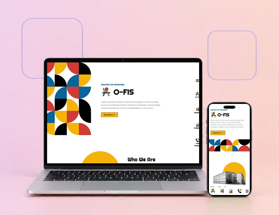
The O-FIS website on a laptop and a phone, designed by ZenWeb
ServicesWeb design
IndustryCommercial furniture
LocationMalaysia
LanguagesEnglish
01

About O-FIS

O-FIS is a furniture brand for commercial and residential spaces. It groups its range into three markets: office, education and hotel. The products include meeting tables, ergonomic chairs, workstations, benches and shelving, each listed with its dimensions and the colours and finishes on offer. The range is meant for workspaces, classrooms and hospitality spaces alike.

The brand takes orders of any size, with no minimum quantity. Buyers can pick from a wide range of colours and ask for layouts to be customised to their space. Full catalogs for each market are available on request, and there is a dealership and partnership programme for businesses that want to work with the brand.

Based in
Malaysia
Offers
Office, education and hotel furniture
Products
Chairs, tables, workstations, benches and shelving
Customers
Offices, schools, colleges, training centres and hotels
Ordering
No minimum order quantity
Website
English
02

Who the website is for

Office managers and interior designers

They need exact sizes and finishes before they plan a layout. Each product on the site lists its dimensions and colour options, filtered by chair, table, bench or shelves.

Schools and hotel buyers

They want furniture made for their kind of space. The site splits the range and the catalogs into office, education and hotel, so they only browse what fits.

Dealers and partners

Businesses that want to resell or work with the brand have their own Collaborate With Us page, reached from the side menu.

03

Page-by-page tour

Screenshots of the live site, taken October 2026.
o-fis.com
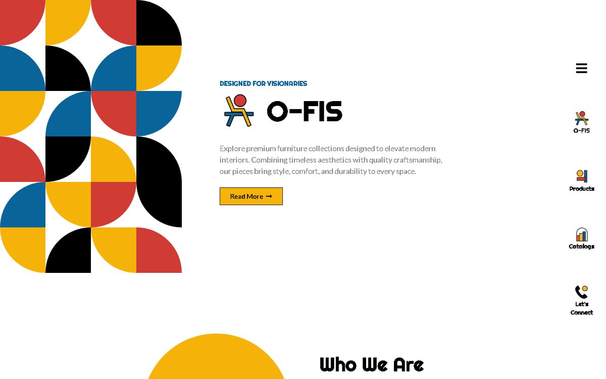
Home page of the O-FIS website
Home page

Bold shapes, then the three markets

The home page opens with a block of red, yellow, blue and black quarter-circles beside the O-FIS logo. It then introduces the brand, shows its office, education and hotel work in three photo cards, and previews featured products.

  • Bauhaus-style pattern in the hero
  • Office, education and hotel cards
  • Request Catalog button at the end
o-fis.com/our-product
Our Products of the O-FIS website
Our Products

Every product with its size and finishes

The products page lets buyers switch between Office, Education and Hotel collections, then filter by chair, table, bench or shelves. Each product card gives its dimensions and colour options, with a link to ask about more colours.
  • Collections for office, education and hotel
  • Filters by chair, table, bench and shelves
  • Dimensions and finishes on every card
o-fis.com/catalog
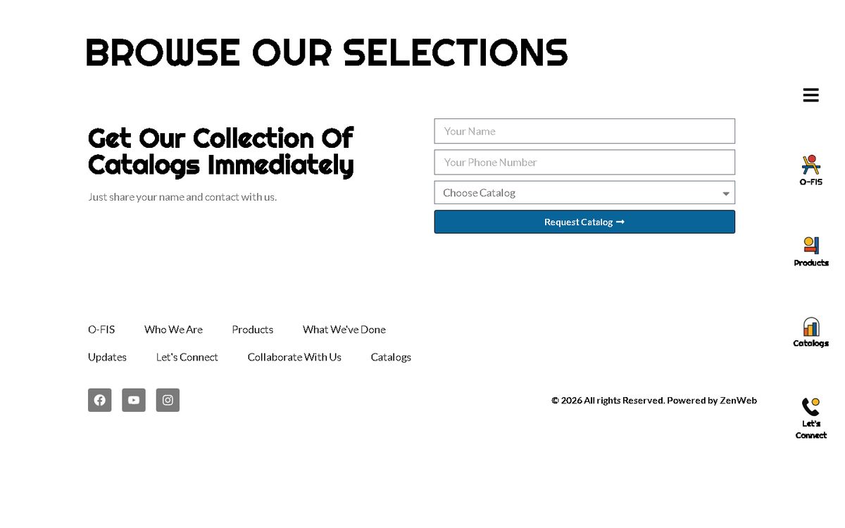
Catalogs of the O-FIS website
Catalogs

Full catalogs for each kind of space

The Catalogs page sorts the brand's catalogs into hotel, education and office. Visitors can open each catalog on the page, or fill in a short form to request the one they want.
  • Catalogs grouped by hotel, education and office
  • View Catalog buttons for each one
  • A short request form with a catalog dropdown
o-fis.com/article
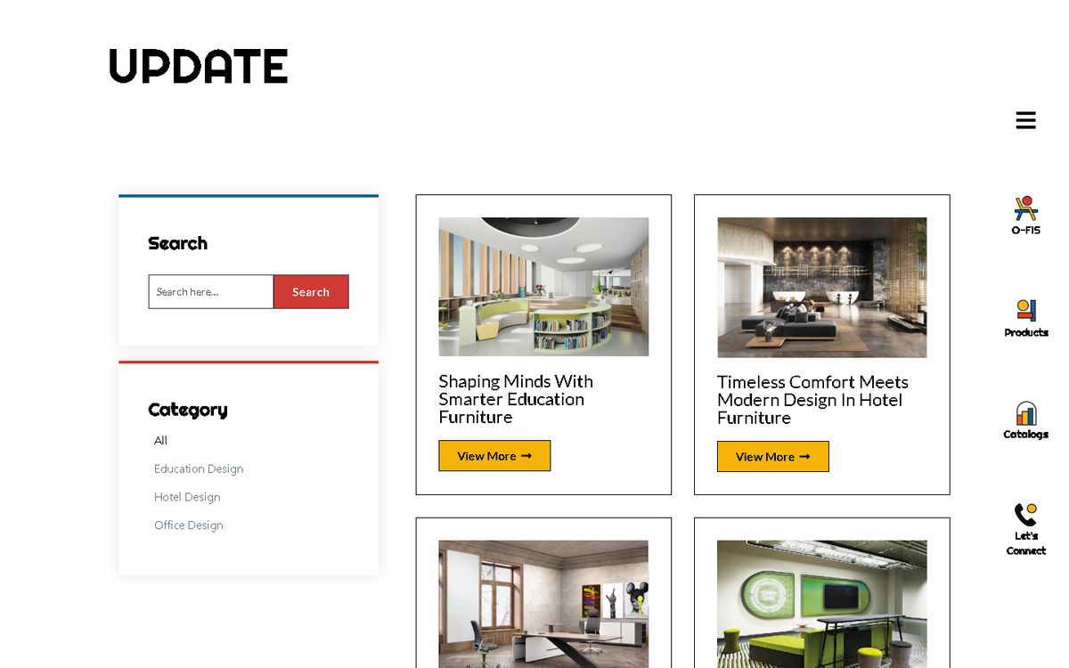
Updates of the O-FIS website
Updates

Articles on designing offices, classrooms and hotels

The Updates page carries articles on furniture for each market, such as smarter education furniture and human-centred office design. A category filter and search box sit beside the list.

  • Articles filed under office, education and hotel design
  • Search box and category list
  • View More link on each article
04

Features built in

  • Side icon menuA slim rail of icons on the right opens the brand, products, catalogs and contact sections.
  • Product filtersProducts filter by collection and by type: chair, table, bench or shelves.
  • Specs on every productEach product lists its dimensions and the colours or finishes available.
  • Catalog requestsA short form lets buyers choose the hotel, education or office catalog they want.
  • Design articlesAn Updates section with articles sorted by office, education and hotel design.
  • Easy to updateSet up so new products and catalogs can be added in-house.
Mobile view

Made for phones as well

On a phone, the side icon rail folds into a menu button and the product cards stack one per row. Each card keeps its dimensions and colour list, so buyers can check specs on site visits.
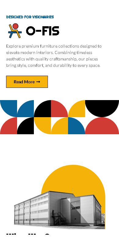
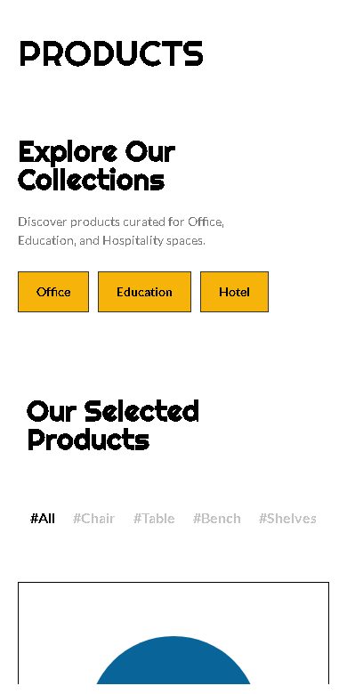
O-FIS website on a phone
05

Design choices

Photography

Black-and-white photos of offices, libraries and hotel lobbies, set against blocks of bold colour.

Colour

Primary red, yellow and blue with black, in a Bauhaus pattern of quarter-circles taken from the logo.

Type

A rounded retro display font, Righteous, for headings, with Lato for body text.

Why we built it this way

Furniture buyers for offices, schools and hotels need different things, so the site splits the range and catalogs three ways. Listing sizes and finishes on every product saves a round of questions before a quote. The bold Bauhaus look gives a furniture brand a clear identity of its own, in place of a plain product list.

06

More work like this

Selling furniture to offices, schools or hotels?

Talk to us about a website that shows your range with full specs and makes catalogs easy to request.

Get a free website proposal

Get A Free Proposal

Complete the form and our team will contact you to discuss your goals. Let’s grow your business.