Share this post:
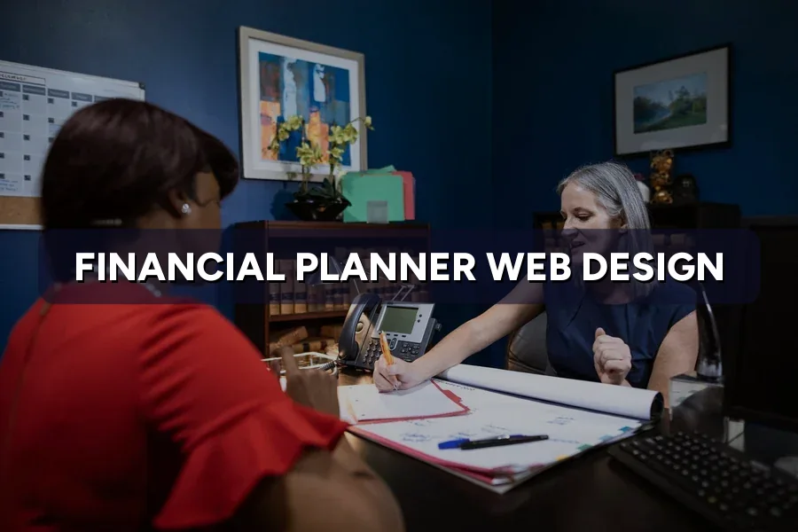
Most advisory websites in Malaysia look the same: a skyline photo, the words “your trusted financial partner”, four service icons, and a contact form. The visitor learns nothing they could not have guessed.
Meanwhile the person on the other end is doing something specific. They are checking whether you are licensed, whether this will cost RM 500 or RM 5,000, and whether you look like someone they can tell the truth about their finances.
ZenWeb builds websites for licensed advisory firms and other trust-heavy Malaysian businesses across 500+ accounts. In web design for financial planners, the pattern is always the same: the design is fine, the verification is missing.
Getting website visitors but no consultation bookings?
We rebuild the booking path before touching the visuals. Compare our web design packages →
Before the detail, a short view of what actually separates advisory sites that convert.
Source video: Less Is More: The #1 Design Strategy for Financial Advisor Websites on YouTube
Quick Answer: A financial planner’s website is where a stranger checks you before trusting you with their EPF, their insurance and their children’s education fund. Its job is to close doubt, which is why a properly structured advisory site reads like evidence, not advertising.
Shops sell in one visit. Planners do not, and that single difference shapes every decision in web design for financial planners. The visitor usually arrives after a referral, a LinkedIn post or a search about EPF, and they are quietly running four checks:
Answer those four and the enquiry arrives half-sold. Miss them and you collect vague “may I know more” messages, no matter how much traffic the wider marketing stack delivers.
Quick Answer: Four things: who you advise, your licence line in plain text, what the first meeting costs, and one booking button. Everything else waits for the second scroll.
The first phone screen is roughly 600 pixels, and most advisory firms spend it on a slogan. A stronger version reads like a sentence a human would say: Licensed financial planning for Malaysian families and business owners. CMSL-licensed. First 45-minute consultation, no charge. Then one button.
Two habits waste that space: a rotating slider hides your second message, and twin buttons split attention. Choose one primary action and keep the WhatsApp button as the quieter second option.
Quick Answer: Print the actual licence number and link to the public register. A logo proves nothing, but a CMSL or CMSRL number a visitor can type into the regulator’s own search turns a claim into a fact.
Malaysian consumers have been trained by years of scam coverage to distrust financial promises. That works in your favour if checking you is easy. Three placements do most of the work:
Add your professional designations by their full names, since a visitor who does not know what CFP or RFP stands for cannot be reassured by the letters alone.
Quick Answer: The adviser profile is the most-read page on an advisory site after the homepage. It needs a real photo, the licence, who you typically advise, and one honest line about how you work.
Firms treat the profile as an afterthought: “Ahmad brings over a decade of experience across wealth management solutions.” Nobody has booked a meeting because of that sentence. What the reader wants is narrower, so give each adviser their own URL and cover:
This is the page a referral checks before replying, and it does double duty as a personal brand asset across LinkedIn and search.
Quick Answer: Publish the structure and a range, not a fixed quotation. A page showing what a one-off plan, an ongoing review and an implementation-only engagement typically cost removes the biggest reason people never enquire.
Planners resist this for a fair reason: every case differs, and a published number invites arguments. But the visitor is already guessing, and their guess is usually wrong in both directions.
Fee pages also attract people already searching for cost, which is why they earn links from the firm’s search pages better than a services list does.
Quick Answer: A published fee page lifts booked consultations furthest, followed by adviser profile pages and a verifiable licence line. Awards carousels and stock imagery move almost nothing.
| Element added | Relative lift | Index | Build effort |
|---|---|---|---|
| Published fee structure page | 100 | Low | |
| Individual adviser profile pages | 78 | Medium | |
| Verifiable licence line and register link | 66 | Low | |
| Calendar booking with visible time slots | 59 | Low | |
| Life-event landing pages (EPF, education, retirement) | 47 | High | |
| Retirement or protection gap calculator | 34 | High | |
| Awards carousel and stock office imagery | 5 | Medium |
Source: ZenWeb client tracking, Malaysia, 2024-2026.
Read the effort column beside the index. The three strongest elements are all low or medium effort, which is the quiet advantage of web design for financial planners: the items that book meetings are cheaper than the ones that merely look expensive.
Quick Answer: Build one calculator that produces a gap the visitor cannot ignore, such as a retirement shortfall or a protection gap. Skip the compound-interest widget everyone already has on their phone.
Calculators are the most requested and least profitable item on an advisory build. Three rules keep them useful.
Follow the result with a booking option rather than a download, and label the output as an estimate for discussion. One well-built tool beats five widgets nobody finishes, and it gives your paid social campaigns something to send cold traffic to.
Quick Answer: A working advisory site sits between RM 5,000 and RM 20,000, depending on how many adviser profiles, life-event pages and tools it carries. Below RM 3,000 you are buying a template with a contact form.
| Tier | Build cost | Build time | What it includes | Booked consultations a month |
|---|---|---|---|---|
| Template starter | RM 1,500 to RM 3,000 | 1 to 2 weeks | Five pages, generic contact form, stock imagery | 0 to 2 |
| Credibility site | RM 5,000 to RM 9,000 | 3 to 5 weeks | Licence page, fee page, adviser profiles, calendar booking | 4 to 9 |
| Life-event site | RM 10,000 to RM 15,000 | 6 to 9 weeks | Everything above plus six to ten life-event pages and one calculator | 12 to 22 |
| Multi-adviser practice build | RM 15,000 to RM 20,000 | 9 to 13 weeks | Adviser routing, bilingual pages, CRM handover, secure document intake | 25 to 40 |
Source: ZenWeb client tracking, Malaysia, 2024-2026. Consultation figures assume the site is supported by active search and referral traffic.
That last column only holds if traffic exists, so the build belongs in the same budget conversation as the paid search plan. General build costs across industries sit in our website pricing guide.
Not sure which tier your practice actually needs?
We scope advisory sites around the consultation diary, not the page count. See our web design pricing →
Quick Answer: Design the disclaimer into the layout instead of hiding it in the footer. Every page that discusses money needs a short general-information line, and no page should carry a return figure, a guarantee, or a client’s investment result.
Compliance and conversion argue less than planners expect. The wording that keeps a regulator comfortable is also the wording that reassures a cautious reader.
Build these as reusable template blocks so a new page cannot ship without them. That is a design decision, not a legal one, and it stops the site drifting every time somebody adds a post.
Quick Answer: Four to five fields, one screen, and a topic selector instead of a message box. Asking what the meeting is about lifts attendance far more than asking for an email address does.
| Form design | Completion rate | Attendance rate | Cost per attended consultation |
|---|---|---|---|
| Name, email, message box | 4.1% | 38% | RM 410 |
| Name, phone, topic selector | 6.7% | 54% | RM 236 |
| Five fields with topic and time preference | 5.8% | 63% | RM 214 |
| Calendar booking with visible slots | 5.2% | 71% | RM 198 |
| Long qualifying form, income and NRIC | 1.6% | 69% | RM 528 |
Source: ZenWeb client tracking, Malaysia, 2024-2026.
The bottom row is the trap. Long forms produce serious enquiries, but so few of them that the cost per attended meeting more than doubles. Ask for income and identity documents after the meeting is confirmed, never before, and treat this as a conversion optimisation exercise rather than a form-length debate.
Quick Answer: Aim to show the main content within 2.5 seconds on 4G. Advisory sites are usually read at night on a phone, and past four seconds the booking form barely gets used.
Google puts Largest Contentful Paint at 2.5 seconds or less for a good experience. Advisory sites drift past it for dull reasons: a hero video, four web font weights, and a chat widget that loads before the content.
| Mobile load time | Booking form started | Licence page viewed | Bookings per 1,000 sessions |
|---|---|---|---|
| Under 2 seconds | 11.4% | 24% | 62 |
| 2 to 3 seconds | 9.6% | 21% | 51 |
| 3 to 4 seconds | 6.8% | 16% | 34 |
| 4 to 6 seconds | 3.9% | 10% | 18 |
| Over 6 seconds | 2.1% | 6% | 9 |
Source: ZenWeb client tracking, Malaysia, 2024-2026.
Notice the middle column. When the site is slow, people stop checking your licence page as well, so the credibility work you paid for never gets seen. The fixes are ordinary: compress images, drop the hero video, defer the chat widget, and follow the page speed checklist on a mobile-first layout.
Site loading slowly on mobile?
We rebuild advisory sites to load fast and book meetings. Explore our web design service →
Quick Answer: Collect the minimum needed to arrange a meeting. NRIC numbers, salary slips and policy documents belong in a secure channel after the client engages, never in a public web form.
Advisory firms collect sensitive data by nature, and the website is the easiest place to collect it carelessly. Four design decisions cover most of the risk:
Handled well, this is another trust signal rather than a chore. Our PDPA compliance checklist covers the wider obligations, and the form decisions belong in your website sign-off checklist.
Quick Answer: Stock photography instead of the actual advisers, no licence number anywhere, no fee signal, and a contact form that asks for a message. Most advisory sites carry at least three of the four.
None of these are expensive to fix, and together they explain most of what goes wrong in web design for financial planners: the gap between a site that looks respectable and one that fills the diary. If traffic is arriving but nothing converts, start with the traffic-without-leads diagnosis; if the layout itself feels wrong, UI and UX basics explain why.
Quick Answer: Effective web design for financial planners means verification first: a checkable licence, a published fee range, a real adviser profile, and a form built around the meeting rather than a message box, on a site built to book consultations.
Very little of this needs a large budget. The licence line takes an afternoon, the fee page a day, and the adviser profiles a week of writing only you can do. Life-event pages and a calculator are the last step, not the first.
The harder part is resisting the corporate instinct. Spend on proof and specificity, and you end up with a site your referrers forward without being asked.
Quick Answer: Planners ask most about build cost, build time, publishing fees, and whether a calculator is worth it. Package detail sits on our web design pricing page.
Between RM 5,000 and RM 9,000 for a credibility site with a licence page, fee page, adviser profiles and calendar booking. Add life-event pages and a calculator and it moves to RM 10,000 to RM 15,000. Template builds under RM 3,000 rarely produce bookings.
Yes, as a structure and a range rather than a fixed quotation. Publishing how you charge, what a first meeting costs and what changes the price removes the main reason cautious visitors leave without enquiring.
In the hero credential line, on every adviser profile, and on a dedicated licensing page that links to the regulator’s public register. Verification is the whole point of web design for financial planners: a visitor who can check you in one click stops comparing and starts booking.
Only after the licence page, fee page and adviser profiles are done. A calculator that shows a savings gap is useful for cold traffic, but it lifts bookings less than the credibility pages that cost far less to build.
Ready to turn your advisory website into a consultation diary?
Book a free 30-minute strategy session. We review your booking path, credibility pages and page speed, then give you a 90-day plan with realistic consultation targets.
Complete the form and our team will contact you to discuss your goals. Let’s grow your business.



Meowketing Specialist
Online