You have about three seconds to convince a visitor to stay. In those seconds they have not scrolled, not read your story, not seen your prices. They have only seen the top slice of your page — the part that loads first. That slice has a name in web design: above the fold.
It is one of those terms that sounds technical but is simple once explained. Most Malaysian SME websites either nail their first screen or waste it on a slideshow and a vague slogan. This guide from the team at ZenWeb breaks it down in plain language. You will learn what above the fold means, where it came from, why it still decides whether visitors stay, and how to build a first screen that works.
Above the fold is really a first-impression problem, and first impressions are the heart of good design. The short video below from Simplilearn explains the bigger picture — how UI and UX design shape the way a site feels in its first seconds. After that, we get into the detail.
Source video: Simplilearn on YouTube
Quick Answer: Above the fold is everything a visitor sees the moment a web page loads, before they scroll. It usually holds the headline, the main image, and the primary button. The term is borrowed from print newspapers, where the top half — above the physical fold — carried the biggest headline to sell the paper.
Old newspapers were folded in half on the stand. Only the top half showed, so editors put the strongest headline and photo there to win a buyer at a glance. Web design borrowed the idea. When a page loads, the visitor sees only the top portion that fits their screen — that is your fold, and it has the same job: earn the next few seconds of attention.
It is part of your online identity, in the same way your domain name is. The difference is that the fold is not a fixed line. It moves with the visitor’s device, browser, and screen size — a point we come back to later. For now, picture it as the first screenful, whatever device that screen happens to be.
Quick Answer: Most first-screen attention lands on a few spots: the headline, the main image, and the primary button. The headline and the primary button pull most of those first seconds, which is why a vague headline wastes your best web design space.
People do not read a new page — they scan it. In the opening seconds their eyes jump to whatever is biggest and boldest, then to anything that looks clickable. The table below groups where that early attention tends to fall on a typical SME homepage.
| First-screen zone | Share of early attention | |
|---|---|---|
| Headline / value proposition | 33% | |
| Primary button / call to action | 22% | |
| Hero image / main visual | 19% | |
| Navigation menu | 14% | |
| Logo / brand mark | 12% |
Source: ZenWeb operational data, 500+ Malaysian SME sites reviewed, 2024–2026. Illustrative and directional, not a guarantee.
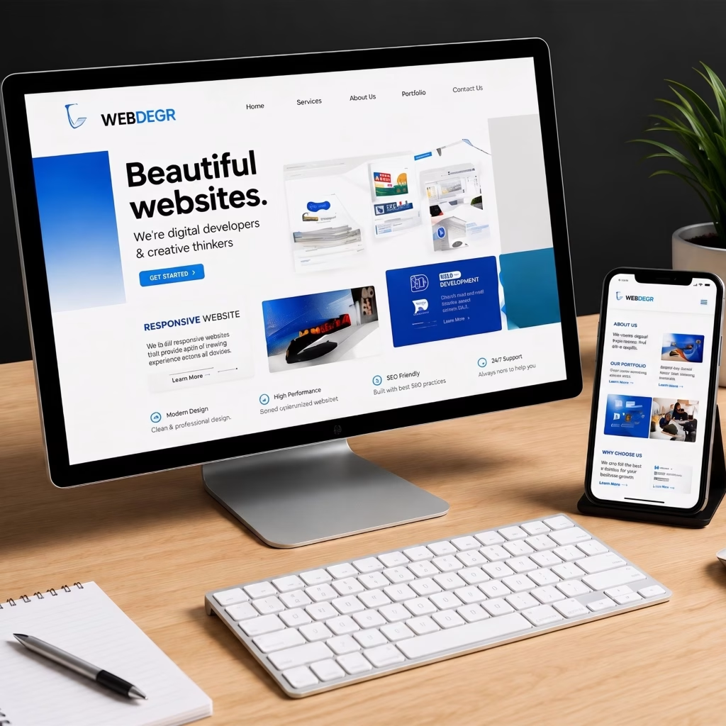
Quick Answer: A strong above-the-fold area answers three questions fast: what is this, why should I care, and what do I do next. In practice that means a clear headline, a one-line benefit, a primary call to action, a supporting image, and a small trust signal — without crowding the screen.
You do not need to fit everything onto the first screen. You need the few things that earn the scroll. The table below lists what usually deserves the spot and why.
| Element | Why it earns the spot |
|---|---|
| Clear headline | Says what you do in plain words — no clever slogan that hides the point |
| One-line benefit | Answers “why should I care” — the outcome the visitor wants |
| Primary call to action | One obvious next step — call, WhatsApp, or enquire |
| Supporting image | Shows the product, place, or result — not a random stock photo |
| A small trust signal | A review count, client logo, or “500+ clients” line to lower doubt |
Reference: ZenWeb web design checklist for above-the-fold layout, 2026.
Is your first screen pulling its weight?
We design first screens that say what you do and turn visitors into enquiries. See our web design service →
Quick Answer: Because the first screen decides whether a visitor stays or leaves. If they cannot tell what you offer in a few seconds, they bounce — and a high bounce rate means fewer leads from the same traffic. A clear, fast first screen keeps more visitors reading long enough to act.
A strong first screen will not earn you backlinks or move you up the rankings on its own — that is the job of good SEO. But it decides what happens once SEO does its work and a visitor arrives. The table below indexes how different first-screen states tend to affect engagement, set against a weak one at 100.
| Above-the-fold state | What the visitor sees | Relative engagement |
|---|---|---|
| Weak first screen | Vague slogan, slow image, no clear button | 100 |
| Clear headline only | Says what you do, but no next step | 118 |
| Headline + visible CTA | Clear offer and an obvious button | 133 |
| Headline + CTA + trust + fast load | Clear offer, button, proof, loads instantly | 149 |
Illustrative, based on ZenWeb client first-impression testing patterns, 2024–2026. Your numbers will vary.
Quick Answer: Yes. People scroll happily today, so the old idea of cramming everything up top is dead. But the first screen still decides whether they scroll at all. Think of it as the gate, not the whole garden — its job is to earn the scroll, not to hold the entire message.
There is a persistent myth that “the fold does not matter any more because everyone scrolls”. The truth is more useful than that. Two things are true at once:
So the modern rule is simple: design the first screen to earn the scroll, then keep delivering as the visitor moves down. The fold is a priority guide, not a hard wall.
Quick Answer: There is no single fold line. It changes with screen size, so a phone shows far less than a desktop. That is why responsive web design matters — your first screen has to work on a small phone first, where most Malaysian traffic now comes from, then scale up.
Because most visitors arrive on a phone, the mobile fold is the one that counts most. The table below shows the rough visible height on common devices — a guide, not exact pixels, since browser bars and toolbars eat into it.
| Device type | Rough visible height | What this means |
|---|---|---|
| Phone (portrait) | ~600–700px | Room for a headline + one button — design this first |
| Tablet (portrait) | ~900–1000px | Headline, image, and button fit comfortably |
| Laptop | ~650–750px | Wider than tall — use the horizontal space |
| Desktop monitor | ~850–950px | Most room, but most visitors are on phones |
Reference: common device viewport heights as a planning guide, 2026. Actual visible area varies by browser and toolbars.
Two visitors on the same page can see different folds. A fast first screen also depends on speed — if your hero image loads slowly, the visitor stares at a blank space, which hurts your Core Web Vitals scores and their patience at the same time.
Does your site look sharp on every screen?
We build fast, responsive sites with a first screen that works phone-first. Compare our web design pricing →
Quick Answer: Lead with a plain headline, add a one-line benefit, place one clear button, support it with a real image, and test it on a phone. Most weak first screens fail on the basics, not the polish — so fix the message before the visuals. Good web design starts here.
You do not need a redesign to improve your fold. Work through these five steps in order:
Quick Answer: The usual mistakes are easy to spot once you know them. Watch for a vague headline, a slow hero image, no clear button, an auto-playing slider, and a first screen never tested on a phone. Each one quietly costs you visitors before they ever scroll.
Run your own homepage past this short list. Most of these take an afternoon to fix and instantly lift your first impression.
Above the fold is a small idea with a big effect. It is the first screenful a visitor sees — the headline, the image, the button — and it decides, in a few seconds, whether they stay or leave. The term came from newspapers, but the lesson holds for every Malaysian business website: lead with your strongest, clearest message, and earn the scroll.
You do not need a fancy first screen. You need a clear one: plain headline, one benefit, one button, a real image, fast on a phone. If you would like that handled properly from the start, our web design service builds every page — first screen included — around clarity, speed, and turning visitors into enquiries.
Above the fold is the part of a web page a visitor sees as soon as it loads, before scrolling. It usually holds the headline, the main image, and the primary button. The term comes from newspapers, where the most important story sat on the top half, above the physical fold.
Yes. People scroll readily now, so you should not cram everything up top. But the first screen still decides whether a visitor scrolls at all. Its job is to earn the scroll with one clear message, then let the rest of the page deliver the detail.
There is no fixed line. The fold is wherever the visible screen ends before scrolling, and that changes with device and browser. A phone shows roughly 600 to 700 pixels of height, a desktop far more. Because most traffic is mobile, design the phone fold first.
Lead with a plain headline that says what you do, a one-line benefit, and one clear call to action such as call or WhatsApp. Add a real supporting image and a small trust signal like a review count. Keep it uncluttered so the message lands fast.
Indirectly. A clear, fast first screen keeps visitors from bouncing and helps your Core Web Vitals, both of which support rankings. But above the fold is mainly a conversion and first-impression factor — the ranking itself is driven by your wider SEO and content.
Ready for a website that earns attention from the first second?
Book a free 30-minute strategy session. We will review your first screen, your speed, and your competitors, then give you a concrete 90-day plan to turn more visitors into enquiries.
Complete the form and our team will contact you to discuss your goals. Let’s grow your business.



Meowketing Specialist
Online