You build a website, it looks sharp on your laptop, and you feel good about it. Then a customer opens it on a phone and the text is tiny, the buttons overlap, and they have to pinch and zoom just to read your prices. Within seconds, they leave. That gap between “looks fine on my screen” and “works on every screen” is exactly the problem responsive web design solves.
This guide from the team at ZenWeb explains what responsive web design is in plain language for Malaysian business owners. We cover what it means, how it actually works, why it matters so much in 2026, what a non-responsive site quietly costs you, and how to make your own site responsive. Understanding this makes you a sharper buyer of web design, even when someone else builds the site for you.
The short video below gives a quick visual overview from a respected web design educator. After that, we break everything down step by step.
Source video: Kevin Powell on YouTube
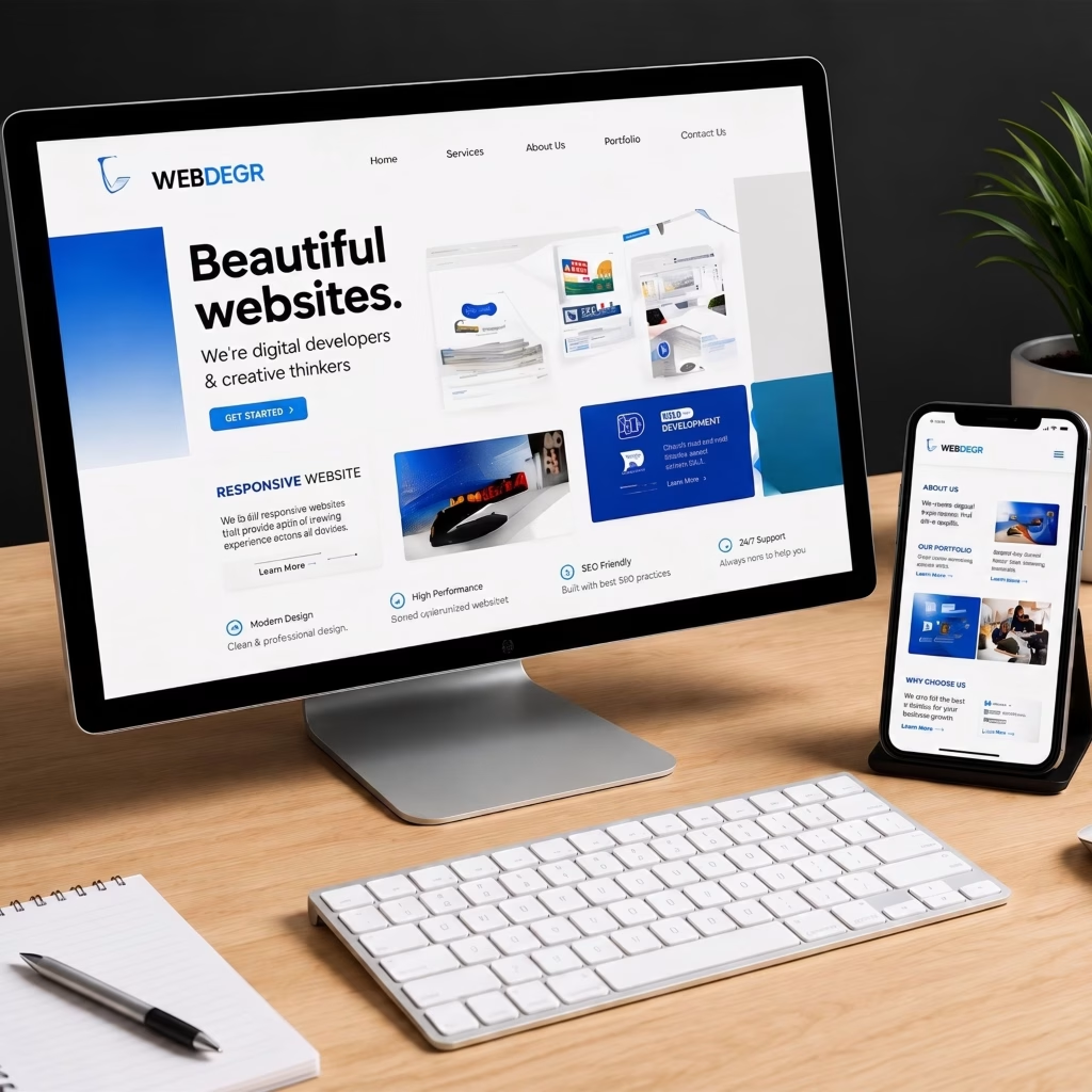
Quick Answer: Responsive web design is the practice of building one website that automatically adjusts its layout to fit the screen it is viewed on. Instead of a separate mobile site, the same pages flex and rearrange so they look right and work well on a phone, tablet, or desktop.
Think of water poured into different glasses. The water is the same; it just takes the shape of whatever holds it. A responsive website works the same way. The content stays the same, but the layout pours itself into the shape of each screen — stacking into one column on a phone, spreading into two or three columns on a desktop.
Before responsive design became standard, many businesses ran two versions of a site: a desktop site and a stripped-down mobile site on a separate address. That meant double the work and content that often did not match. Responsive design replaced that mess with one site that serves everyone. It is a different decision from choosing between a landing page versus a full website, but the same principle applies: one well-built asset beats several half-maintained ones.
Quick Answer: Responsive web design works through three main tools: flexible grids that size in percentages instead of fixed pixels, flexible images that scale to their container, and media queries that apply different styles at set screen widths. Together they let one page restyle itself for any device.
You do not need to code to understand the idea. A responsive site reads the width of the screen and adjusts. Here are the three building blocks that make it happen:
The points where the layout changes are called breakpoints. A typical site has breakpoints for phones, tablets, and desktops. Most modern sites are now built mobile-first, meaning the phone layout is designed first and then expanded for bigger screens. Whether your site runs on a content management system like WordPress or is hand-built, these same principles apply, and visitors still reach it through your domain name.
Quick Answer: Responsive web design matters because most people now browse on phones. If your site is hard to use on mobile, you lose visitors, leads, and search rankings. A responsive site keeps every visitor — whatever device they hold — reading, trusting, and contacting you instead of bouncing to a competitor.
The case starts with where people actually are. Mobile phones accounted for more than 63% of the world’s web page requests in December 2024, per DataReportal’s analysis of Statcounter data. For most Malaysian small businesses we work with, the mobile share of their own traffic runs even higher.
| Device | Share of visits | Relative size |
|---|---|---|
| Mobile | 68% | |
| Desktop | 26% | |
| Tablet | 6% |
Illustrative, aggregated across ZenWeb-managed Malaysian SME sites, 2024–2026. Directional, not absolute.
When two out of three visitors arrive on a phone, the mobile experience is the main experience, not a side detail. A site that frustrates those visitors hands them straight to a rival. Good UI/UX design and a properly responsive layout work hand in hand to keep them.
Not sure how your site looks on a phone?
We audit how your website performs across devices and show you exactly where mobile visitors drop off. See our web design services →
Quick Answer: Responsive design uses one fluid layout that flexes to any width. Adaptive design uses a few fixed layouts chosen by screen size. A separate mobile site is a second site on its own address. For almost every Malaysian business, responsive is the simplest and cheapest to run.
These three approaches are often confused, but the difference is easy to see side by side. The table below lays out how each one behaves day to day.
| What changes | Responsive | Adaptive | Separate mobile site |
|---|---|---|---|
| Layout | One fluid layout | A few fixed layouts | A whole separate site |
| Maintenance | One site to update | Several layouts to test | Two sites to update |
| SEO | One URL, strongest signal | One URL, usually fine | Split signals, harder |
| Best for | Most business websites | Heavy, complex web apps | Rare legacy cases |
A plain-English comparison of the three ways to serve mobile visitors.
For the vast majority of Malaysian SMEs, responsive design wins on cost, simplicity, and search performance. Adaptive design has its place on large, complex platforms, and a separate mobile site is now mostly a legacy choice you will rarely need.
Quick Answer: A non-responsive website costs you in bounce rate, time on page, and lost enquiries. Mobile visitors who have to pinch, zoom, and squint leave fast, and Google reads that frustration as a weak page. The damage is invisible on your laptop but very real in your lead count.
The cost rarely shows up as an obvious error. The site loads, so it looks fine to you. But the numbers from mobile visitors tell a different story when a site is not responsive, as the comparison below shows.
| Mobile metric | Non-responsive site | Responsive site |
|---|---|---|
| Bounce rate | 68% | 42% |
| Avg. time on page | 0:38 | 1:52 |
| Pages per visit | 1.4 | 2.9 |
Illustrative, based on ZenWeb client sites before and after a responsive rebuild, 2024–2026. Directional, not absolute.
There is a search cost too. Google now indexes the mobile version of your site first, a practice called mobile-first indexing. If your mobile pages are clumsy, your rankings suffer everywhere — which is why responsive design and how SEO actually works are so closely tied together.
Quick Answer: Going responsive usually lifts mobile enquiries and lowers your cost per lead. When forms, buttons, and content fit the phone properly, more visitors complete an action instead of giving up. The payoff shows directly in enquiry rates and the price you pay for each lead.
The upside of a responsive rebuild is not abstract. It shows up where it counts: more enquiries from the same traffic. The table below tracks what typically shifts after a Malaysian SME site moves from a non-responsive layout to a properly responsive one.
| Measure | Before | After |
|---|---|---|
| Mobile enquiry rate | 1.1% | 2.6% |
| Form completion | 31% | 58% |
| Cost per lead | RM 70 | RM 39 |
Illustrative, based on ZenWeb responsive rebuild projects for Malaysian SMEs, 2024–2026. Directional, not absolute.
Cheaper, more frequent leads compound over time. A site that converts mobile visitors also makes every ringgit of advertising work harder, and it earns the kind of helpful, well-structured pages that rank and attract backlinks over the long run.
Ready to turn mobile visitors into leads?
We rebuild slow, clunky sites into fast, responsive ones that convert on every device. Explore our web design services →
Quick Answer: Responsive design has gone from a nice extra to the standard way websites are built. Nearly every new professional site launches mobile-first and responsive by default, because search engines, browsers, and visitors all now expect it. A non-responsive site looks dated the moment it goes live.
This shift did not happen overnight, but it is now near-total. Across the new sites we build for Malaysian SMEs, responsive design has become the unquestioned baseline rather than an upsell.
| Year | Share built responsive | Trend |
|---|---|---|
| 2020 | 88% | |
| 2022 | 95% | |
| 2024 | 99% | |
| 2026 | 100% |
Illustrative, based on ZenWeb client builds, 2020–2026. Directional, not absolute.
The lesson for any business owner is simple. Responsive is no longer a feature to pay extra for; it is the floor. If a quote for a new website treats mobile as an add-on, that is a red flag worth questioning. For a fuller picture of where a website fits in your marketing, our beginner’s guide to digital marketing in Malaysia is a useful next read.
Quick Answer: To make a website responsive, design the mobile layout first, use flexible grids instead of fixed widths, let images scale, add breakpoints with media queries, and test on real phones. Most modern themes and page builders handle the heavy lifting, so the work is more about discipline than deep coding.
You do not need to rebuild from scratch in most cases. Whether you do it yourself or brief a designer, these five steps take a site from rigid to responsive:
A few pitfalls trip people up along the way. Keep an eye out for these:
Responsive web design is simply the practice of building one website that fits every screen. It uses flexible grids, scalable images, and media queries to reshape the same pages for phones, tablets, and desktops. With most Malaysians browsing on mobile, it is the difference between a site that quietly loses visitors and one that turns them into enquiries.
The practical path is clear: treat mobile as the main view, keep one responsive site instead of several, and test on real phones. If you would rather have it handled, ZenWeb’s web design team builds fast, responsive sites that convert across every device. New to the bigger picture? Start with our guide on what a CMS is and how it powers an easy-to-update site.
Responsive web design is a way of building one website that automatically adjusts to fit any screen size. The same pages rearrange themselves so they look good and work well on a phone, tablet, or desktop. You maintain a single site, and every visitor gets a layout that suits their device.
It matters because most visitors now arrive on phones. If your site is hard to use on mobile, people leave quickly and Google ranks you lower. A responsive site keeps mobile visitors reading and contacting you, which protects both your traffic and your leads. For most Malaysian businesses, it is now essential rather than optional.
They overlap but are not identical. Mobile-friendly means a site simply works on a phone. Responsive design is the specific method of using one flexible layout that adapts to every screen size. A responsive site is always mobile-friendly, but some mobile-friendly setups, like a separate mobile site, are not responsive.
Because responsive design is now the standard, it is usually built into the price of a professional website rather than charged as an extra. Costs vary with the number of pages and features, but a typical small-business site is a one-off investment, often starting in the low thousands of ringgit. Always confirm responsiveness is included in any quote.
Yes. Google uses mobile-first indexing, meaning it looks at your mobile pages first when deciding rankings. A responsive site gives Google one clean URL and a strong mobile experience, which supports better rankings. A clumsy mobile site, by contrast, can drag down your visibility across all devices.
Ready for a website that works on every screen?
Book a free 30-minute strategy session. We will review your current site on mobile, show you where visitors drop off, and give you a concrete 90-day plan to turn your website into a lead-generating asset, with a clear timeline and budget.
Complete the form and our team will contact you to discuss your goals. Let’s grow your business.



Meowketing Specialist
Online